All the AWS security news, research, and technical changes in your inbox, every Monday.
Eleventeen ways to delete an AWS resource
by Rami McCarthy and Daniel Grzelak
Deleting stuff in AWS brings us great joy. There’s something addictive about the infinite game of trying to get your AWS bill from $2.57 to $0. We know it’s not possible but we feel compelled to try. It’s like whack-a-mole, but the mole is your family asking where the grocery money went.
In this never ending quest for $0, we’ve noticed that AWS keeps us on our toes by never doing deletes the same way twice. We have reason to believe a hamster has been imprisoned and is now choosing confirmations at random. It’s the same one they have divining feature names like “AWS Systems Manager Distributor” and “AWS Deadline Cloud”.
Technically Rami thinks it’s because of "two pizza teams" doing their thing but he’s wrong.
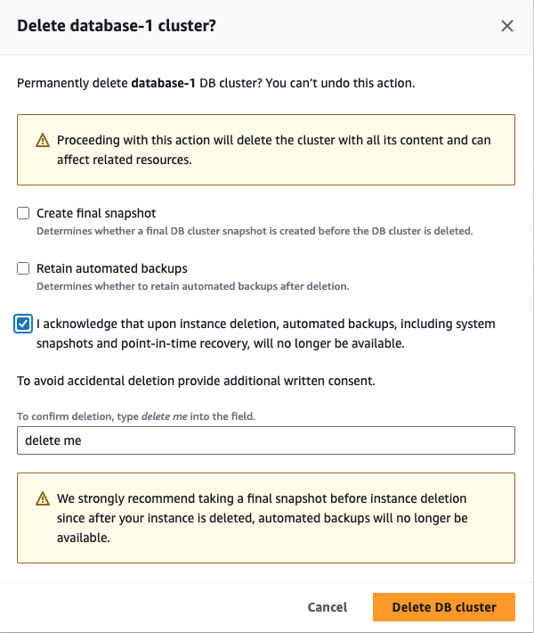
Here are some examples:
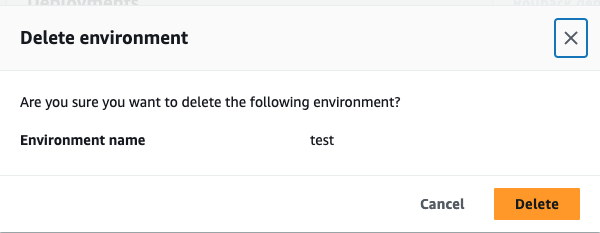
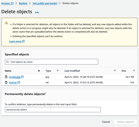
Why do two security engineers care about UX? Well, these confirmation dialogs are a “soft” control. And secondly, we’ve seen a series of recent security issues (1, 2) that are steeped in UX. Deleting important stuff accidentally sucks.
How to solve the riddle? We consulted the oracle (aws-security@amazon.com), who offered us a map to the knowledge we seek: Cloudscape
Cloudscape is the design system behind the AWS Management Console. Colour us both surprised, we had no idea there was a design system. Then again, design isn’t really our ambit, have you seen our personal sites…
So, what does it have to say about “delete patterns”?
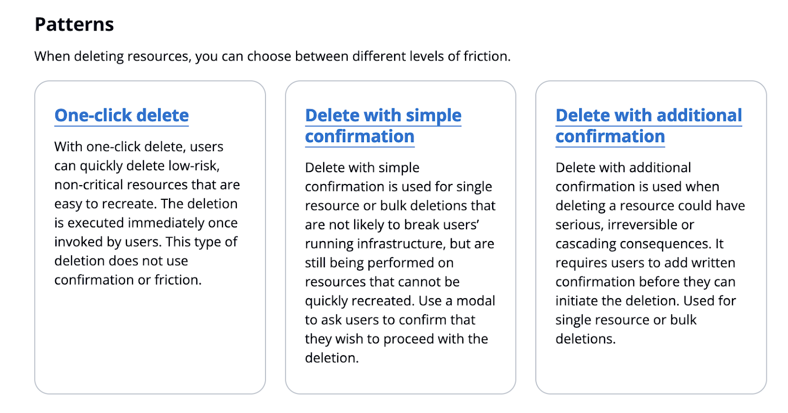
Okay, that’s helpful. But actually, most of the inconsistency falls under “Delete with additional confirmation.”
1. One-click delete
This should probably be “One click delete with save confirmation”. It’s most commonly used for tags and allows the user to see how things will look before committing to the deletion.
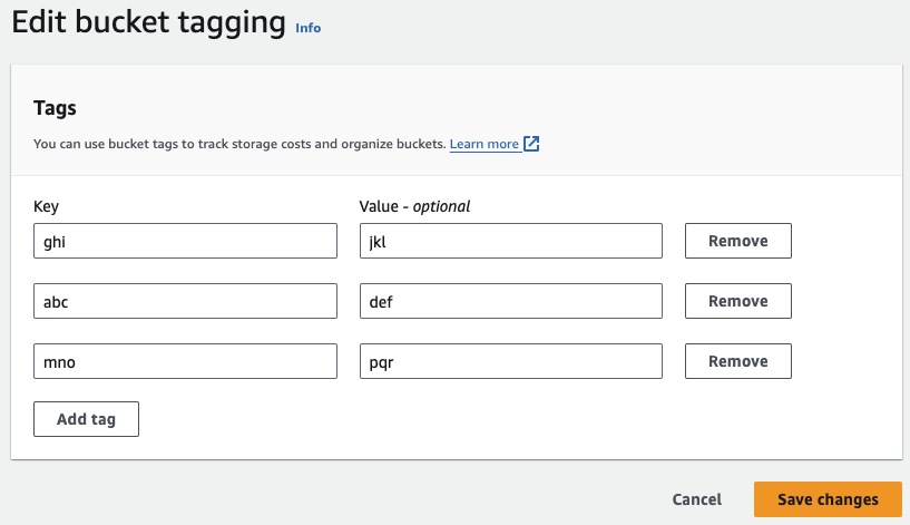
2. Delete with simple confirmation
This boils down to a dialogue with a do it button, that many people will click without thinking, but it is still a footgun for a decent percentage of users, us included.
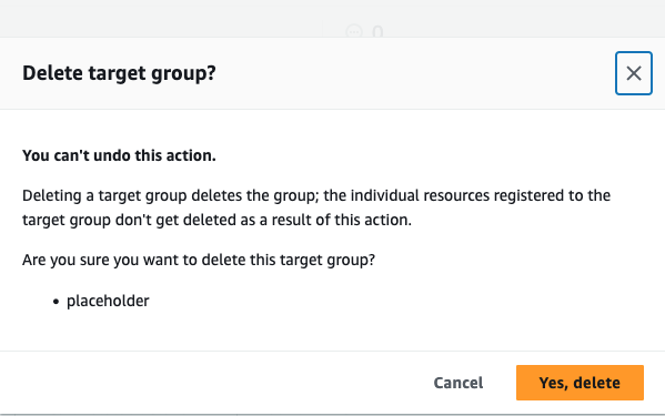
3. Delete with additional confirmation
3.1 Type generic action text
This one comes in various flavours that are equivalent for all intents and purposes. Type something like “delete”, “confirm”, “delete me” etc. There’s no active engagement required from the user to understand what is being deleted. It’s only slightly better than a delete button.
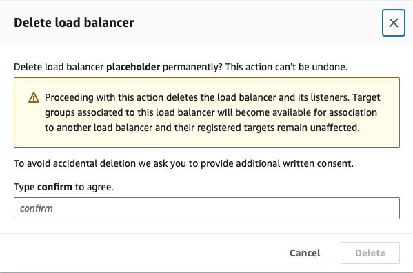
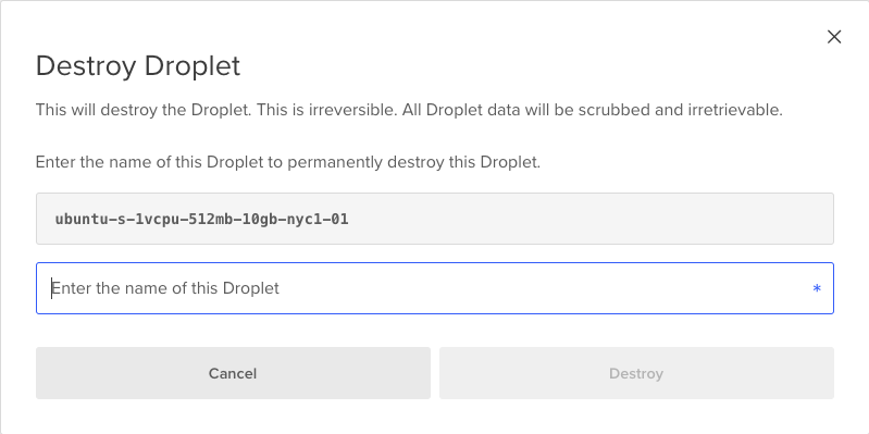
3.2. Type resource ID
Forcing the user to type something related to the thing they are deleting is a pretty significant improvement on just typing “delete”, but when it’s a randomly generated ID it still’s error prone. Who can tell one organization ID from another? Using the resource name or a combination of ID and name might be a slightly better alternative.

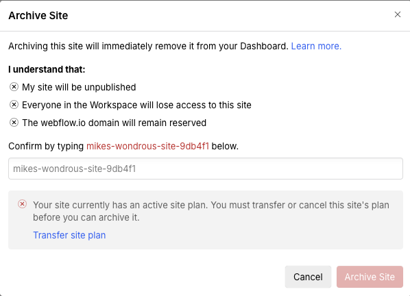
3.3 Acknowledge consequences
Deleting one resource often has implications beyond that resource, and the user needs to understand those. One way to try to get them to understand is having a checkbox they have to click to confirm they do. It would be great to see data on how effective this is.
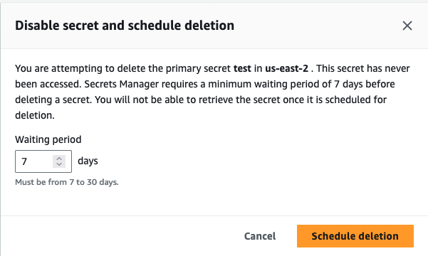
3.4 Schedule deletion
This is an undocumented pattern to some degree. It is how KMS does it, probably because self-ransomware is not as fun as the real deal.
Details divined from disciples of deletion
So, what have we learned?
-
No, the rule isn’t “the more expensive the resource, the harder we’re going to make it for you to get out of the bill”
-
There is a reason behind the madness, but …
-
The design system isn’t enough to stop engineers from closing their eyes and slamming the Shift key at random while spelling Delete dElETe delete
-
AWS is not the only company to have this problem. Maybe there’s an opportunity to standardise more broadly. Does anyone know a UX influencer?

What should you take away?
-
A standard design system is a useful security primitive as long as it’s easy to apply
-
Balance increased confirmation diligence with user experience in delete actions
-
Daniel and Rami, those guys are so kooky
What should AWS take away?
-
Customers notice the inconsistency of their UX
-
The delete patterns could do with additional specification on the “additional confirmatory dialog”
-
Show us the user behaviour data! Please.
